BRANDING
We create powerful, recognizable brands that convey the companies' essence. Once created,
a brand must be used consistently. Consistence builds brand strength.
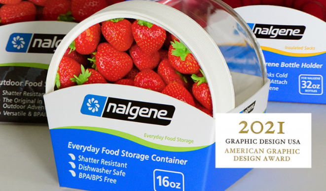
We redesigned Nalgene Outdoor’s packaging and branding with a consistent, eco-friendly structure and a signature round shape. A color-coded wave enhances brand identity, differentiates product categories, and reinforces themes of motion and adventure. The design ensures all products feel cohesive, with clear communication of features, benefits, and the tagline "For your everyday adventures."
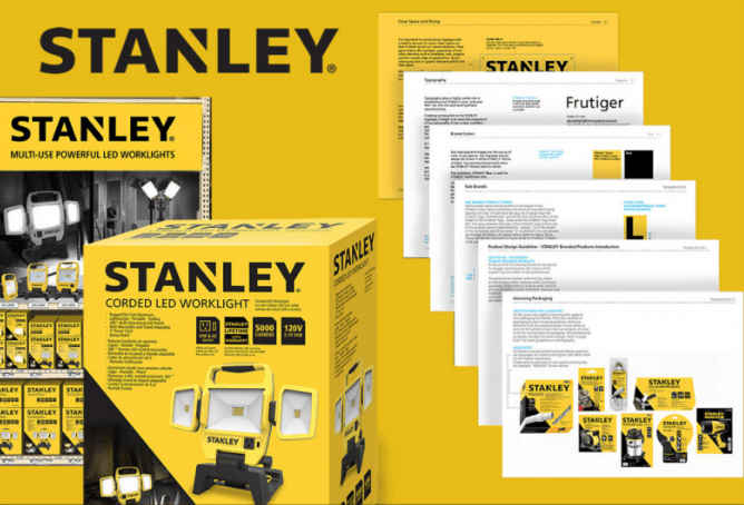
We helped STANLEY develop its new brand and packaging look, creating a comprehensive brand standards manual. Working closely with SBD teams, we established brand rules for packaging, marketing, advertising, and more. This guide ensures consistent branding across all materials, strengthening the brand’s identity and voice.
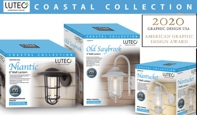
The Lutec Coastal Collection brand began as a packaging project and evolved into a full branding initiative. We designed packaging, merchandising, and marketing materials, using warm silhouettes and nautical elements to enhance the coastal theme. Our 3D endcap render in store before it was in-store and packaging design helped Lutec secure a $10 million deal with The Home Depot.
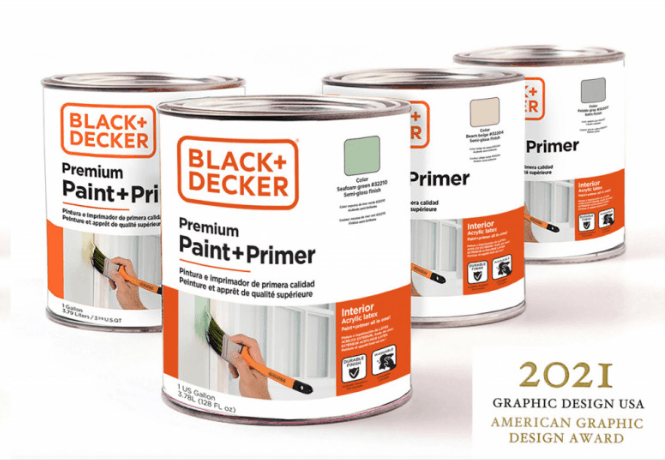
We designed a new look for Black+Decker paint, featuring in-use imagery that connects with consumers by showcasing the exact paint color in a home setting. Clear labels, bold branding, and consistent packaging make key details easy to find, setting it apart from competitors. This award-winning design strengthened brand identity and won a 2021 Graphic Design USA award.
We redesigned the packaging and branding of nalgene Outdoor products and accessories. We engineered a consistent packaging structural style that was simplified, environmentally friendly, and incorporated a round friendly shape throughout the line. We also considered packaging costs, especially for very inexpensive accessory items and parts. The color-coded wave became the new brand graphics that communicates motion, activity and liquids as part of the brand theme. The color-coded wave differentiates quickly between different product categories. Everything is consistently branded and all items feel like part of a family of products. All features, benefits, and tagline "for your everyday adventures" are clearly communicated.
We helped STANLEY create and develop the new Stanley brand and new packaging look. We also created the new STANLEY brand standards manual. We worked closely with the SBD internal teams to produce brand rules and guides for all types of materials and situations. We applied the new branding and also created design examples in the brand guide for packages, merchandisers, marketing materials, advertising, tradeshows, websites, and photography. More that was covered were logo & font usage, and icon designs. This comprehensive brand manual was produced to ensure that the new brand we helped develop would be used consistently across all aspects of communication and that we spoke with one clear brand voice. If a brand is used consistently, it will build brand strength!
The Lutec Coastal Collection brand actually started from a packaging project for these new products. As we created the packaging look, we also created the new brand. The new look was applied to other commercialization elements like merchandising signage and collateral marketing materials. We created the product photography images and chose to use silhouettes to convey a soft, warm, homey, decorative feeling. The nautical product names combine with the blue colors further enhance the coastal theme. At POP we also incorporated oceanfront homes photography to enhance the harsh oceanfront weather that these products can easily endure. We impressed the buyer with our design of brand packages and an endcap 3D render which helped Lutec seal a $10 million deal with The Home Depot.
We createed a new look for Black&Decker paint that ties into the home theme by showing a paint brush in use painting an interior wall next to a French door. The paint in the photos show the exact match color of what is being sold in the can. This connects to the consumer while communicating color and showing what the color might look like in a room. We made a large, strong logo and a very clear product name. We also made clear identifiers for interior/exterior, Type of paint, and color swatch. All of this helps to clearly communicate the main details that a consumer needs to make a purchase. These elements are not always easy to find on competitors packaging. We made all packages in the line consistent as that builds a brands strength. This won a branding award from Graphic Design USA in 2021.